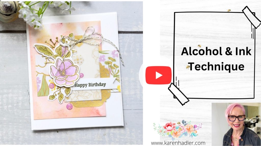
For today’s card, I’m creating a soft, blended background using ink pads and isopropyl alcohol. I’ve done similar techniques with water before, but this time the alcohol was a happy accident – my spritzer was already filled with it, so I thought, why not? So I am excited to share with you the Alcohol & Ink Technique.
I’m so glad I tried it, because the results were gorgeous.
What I used:
- Thick Basic White cardstock
- Ink pads in:
- Isopropyl alcohol (I buy mine from the greengrocer here in NZ)
- A stamping block
The key thing to remember with this technique is less is more with colour. Too many inks can turn muddy. I also found I needed a fair amount of alcohol to really get the colours moving and blending together.
Once spritzed, the alcohol blends the inks beautifully and dries much faster than water. Every single background turns out differently – which is honestly part of the magic.
Building the Card 🧡
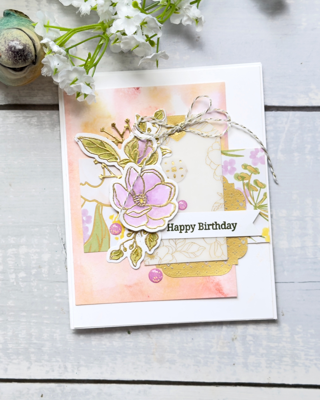
Once the background was dry, I trimmed it down and used it as the main feature panel on my card front. The colours deepen slightly as they dry, which adds even more interest.
I paired the background with:
- Coordinating designer series paper from the suite
- Gold elements from the Beautifully Adorned Ephemera Pack
- Vellum layers to soften the look
I love layering different shapes and textures – it’s one of my favourite parts of card making.
Gold-Embossed Florals & Colouring 🌿
I had prepped some gold heat-embossed floral images ahead of time and coloured them using Stampin’ Blends.
For the leaves, I used Old Olive (light and dark), and for the flowers I worked with Fresh Freesia and a touch of Highland Heather for depth. I tend to colour dark to light, but there’s no right or wrong – just do what works for you.
A little tip I always recommend: once your colouring is finished, gently polish the embossed areas with a microfiber cloth. It really brings back that beautiful gold shine ✨
Final Touches ✂️
To finish the card, I:
- Layered everything until it felt balanced
- Popped the flowers up with dimensionals
- Added a simple double bow using black, white, and gold thread (I’m definitely more of a twine girl than a ribbon girl!)
- Finished with a sentiment punched using the Three Banner Punch
- Added a few purple sparkle embellishments for a subtle pop
I also stamped a coordinating flower inside the card using Peach Pie – a small detail that really completes the look.
A Few Variations 🌸
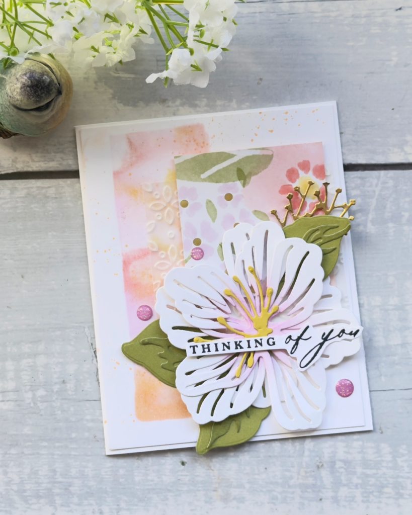
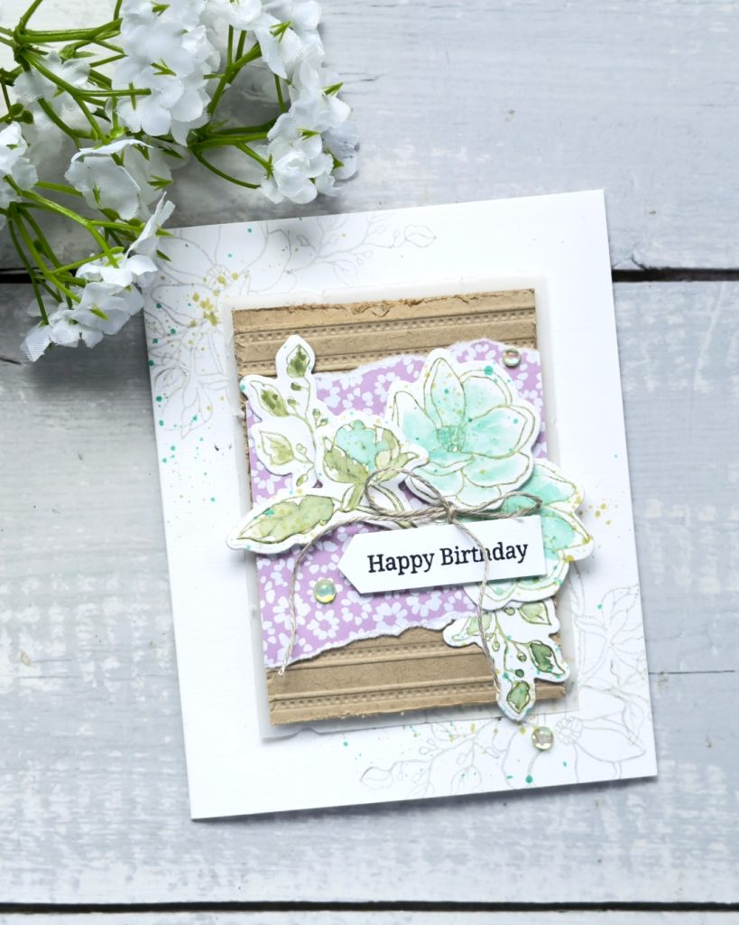
I also played around with this technique in a couple of other ways:
- Stamping directly onto a long strip for a different layout
- Using the large die-cut flower from the suite
- Creating a softer, watercoloured version using Smoky Slate and Old Olive
This suite is incredibly versatile, and I’ve loved exploring just how many different looks you can get from it.
Video Sharing Alcohol & Ink Technique (click on photo below)
Related Posts to Alcohol & Ink Technique
Final Thoughts 💕
This alcohol ink background technique was a bit of a fluke, but it turned into one of those why haven’t I done this sooner? moments. I absolutely loved how it turned out and will definitely be using it again.
If you give it a go, let me know – I’d love to see what you create!
Want to receive regular tips and inspiration don’t miss out and sign up to get my newsletter delivered to your inbox!
Newsletter
Live in New Zealand? if yes and would you like to purchase any of the items shown if you click on each photo it will take you to a list. For the Bundle click below to purchase.

Would like to receive 20% discount on all your purchases? Whether as a hobbyist ,personal use, sharing with friends or to start up a business this maybe just right for you!
Interested and want more information? Click on my TEAM PAGE to learn more.
Thanks so much for stopping by I hope you enjoyed this post. I would love you to leave a comment.
Happy Crafting